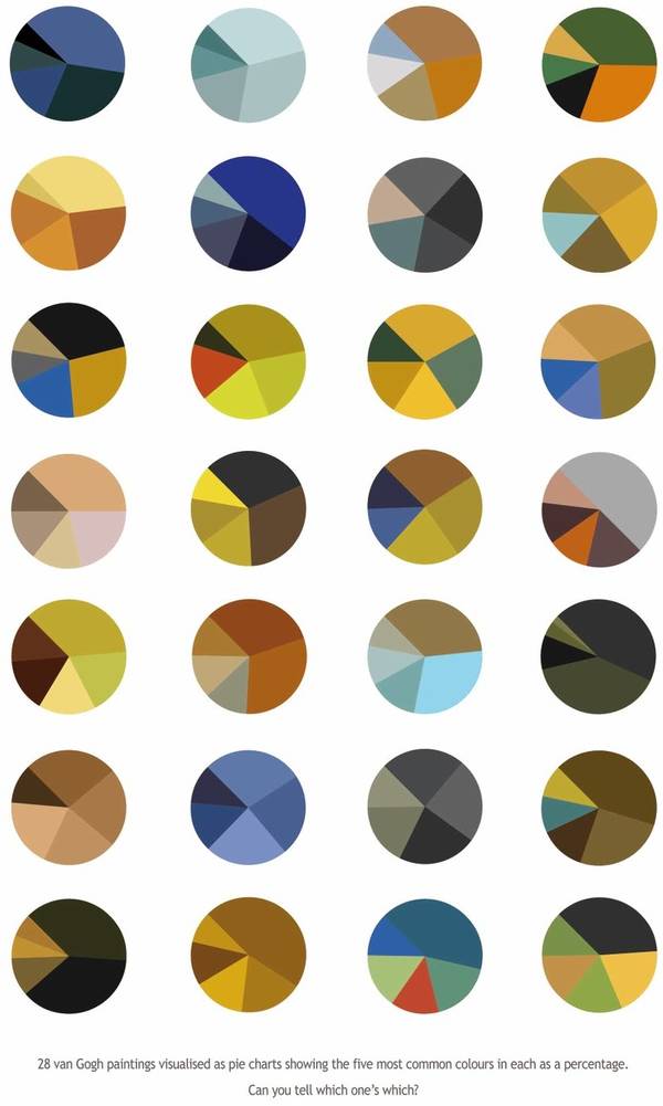
This is Arthur Buxton's set of Van Gogh pie-charts; each one represents the color-distribution in a famous Van Gogh painting (can you guess which is which?)
He sez, 'I know you lot are fans of new ways of visualizing data. As far as I know, I've come up with a novel way of looking at colour schemes. The pie charts are designed to be visually pleasing but also fuction as a colour trend visualization tool. They represent famous paintings, portraying the five most prominent colours in each as a percentage. I'm having a show at The Arts House in Bristol with a drinks reception at 7pm on Friday the 18th of February. Mutants welcome!'
Van Gogh Visualisation
(Thanks, Arthur!)
- Van Gogh's Ear cat toy - Boing Boing
- Van Gogh: really Van Gogh-y. - Boing Boing
- Boing Boing: Van Gogh's Starry Night, the Second Life sim
- Impressionist Cake Boing Boing
- Boing Boing: Van Gogh's Starry Night hand-frosted onto a cake


No comments:
Post a Comment